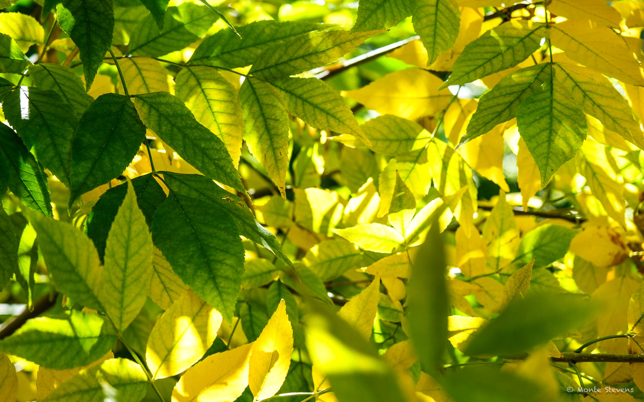
Well I pushed the button yesterday afternoon for a new look to my website. It is much cleaner than my previous website and it also uses more of the screen. Seemed like the previous theme was narrow and left a lot of blank gray space. Please let me know what you think of it. And, please tell me what you find wrong with it. There are two different image sizes for posting. Not sure I like either one. Wish I had something in between and will keep looking into that. My next issue is with my galleries. Sure don’t care for what I had perviously. Enjoy your Sunday!
15 Comments
Earl
I like this theme’s sleek, spacious and streamlined design, Monte. The image size on this post seems acceptable, and I appreciate the convenient feature of expanding it into a full-screen lightbox with just one click. Embracing change can be good. 😉
Monte Stevens
Yes, I agree this image is preferable to the larger one. So, far I like the looks of this. I’m not sure just how long I used the other theme but it was years.
Tom Dills
Very nice, Monte! Like Earl, I like the clean look and modern font. It will be interesting to see what you do with it.
Monte Stevens
Already playing with it this morning. I’m finding myself in a place of worry, which is worrisome. Yes, we’ll see what this evolves into. Some changes I make will probably not be noticed by anyone else. Have a great day!
oneowner
This is a really nice theme, Monte. And a beautiful shot, too. I struggled to find a nice theme so I know what you went through.
Monte Stevens
Thanks. It doesn’t surprise me that we all seem to go through the guessing game of picking the perfect one when we all know there is no perfect one.
Faye White
Looks great! It took me a few visits to figure out how to get here but I persevered 😉
Monte Stevens
I did say it was simple, minimalistic in many ways. I like that about it. If you click on the three lines in the menu bar it will show a what they call a Sidebar Slide Menu which has many of the things that were in my sidebars in the previous theme. It’s taking me a while to get used to it also. If you get lost give me a shout. Thanks for persevering!
Faye White
It was the word Archives that threw me. I thought, I want to see new stuff, not archived stuff. 😊
Alexander S. Kunz
I like the general layout and cleanliness. On the desktop and in a single-column layout like this, I think the photos could be a bit bigger, to make them stand out more?
And please don’t hate me 😀 but on mobile devices, it appears that the bar above the post title that lists the categories has some layout issues if there’s many of them (like in this post; it doesn’t wrap). My general advice would be to look at the site on mobile A LOT — so many visitors come to our websites with small-screen devices; we photographers with our big screens are the exception (unfortunately).
Hope to help…
Monte Stevens
Totally Alex. I’ve done almost everything on a laptop. I just glanced at my phone once I got it activated. You are probably right in that a lot of people will be using their phones. I did see the category list messed up. I guess I could use fewer categories. Thank you! You’ve seen things I didn’t.
Alexander S. Kunz
PS: it’s probably not important but the button labels for “Next” and “Previous” appear to be reversed? On this (currently) newest post, it says “Next” but it takes me to your previous post (and vice versa for older posts).
Monte Stevens
I see that you mean. My previous theme had them as “newest” and “oldest.” Thank again!
Mark
Just seeing the changes now Monte. While I haven’t spent much time “kicking the tires” – first impressions are that it looks nice. It would be nice to have a subscribe to comments or notification of replies via email while you are making changes.
Congrats. A little redecorating can bring fresh inspiration.
Monte Stevens
Thanks, Mark. I used to use Subscribe to Comments Reloaded up until about a year ago. I was having troubles and removed several of my plugins and most of my troubles went away. I like the idea of having the dialogue with comments. It keeps it interesting and we learn more about those who share this lifestyle. I’ve enabled it so lets see what it’s like. Thanks, again!!